
context | pricing model
context | pricing model
A pricing model that users couldn't follow
A pricing model that users couldn't follow
Customer service was flooded with the same questions every week: users didn't understand how subscriptions connected to support plans, couldn't find where to pay invoices, and had no clear path through billing. The dashboard hadn't been designed
with these journeys in mind. My focus was making the financial logic of the product
legible — not prettier, but genuinely clearer.
Customer service was flooded with the same questions every week: users didn't understand how subscriptions connected to support plans, couldn't find where to pay invoices, and had no clear path through billing. The dashboard hadn't been designed with these journeys in mind. My focus was making the financial logic of the product legible — not prettier, but genuinely clearer.
Customer service was flooded with the same questions every week: users didn't understand how subscriptions connected to support plans, couldn't find where to pay invoices, and had no clear path through billing.
The dashboard hadn't been designed with these journeys in mind. My focus was making the financial logic of the product legible — not prettier, but genuinely clearer.
Customer service was flooded with the same questions every week: users didn't understand how subscriptions connected to support plans, couldn't find where to pay invoices, and had no clear path through billing. The dashboard hadn't been designed with these journeys in mind. My focus was making the financial logic of the product legible — not prettier, but genuinely clearer.
Vercom is a cloud-based communications platform that enables businesses to engage customers through multiple channels, including SMS, email, push notifications, instant messaging. Their solutions streamline and automate customer communication, helping companies enhance engagement and optimize marketing efforts.
Vercom is a cloud-based communications platform that enables businesses to engage customers through multiple channels, including SMS, email, push notifications, instant messaging. Their solutions streamline and automate customer communication, helping companies enhance engagement and optimize marketing efforts.
Vercom is a cloud-based communications platform that enables businesses to engage customers through multiple channels, including SMS, email, push notifications, instant messaging. Their solutions streamline and automate customer communication, helping companies enhance engagement and optimize marketing efforts.
LARGE-SCALE PLATFORM MIGRATION: FRESHMAIL TO MAILERLITE
LARGE-SCALE PLATFORM MIGRATION: FRESHMAIL TO MAILERLITE
LARGE-SCALE PLATFORM MIGRATION: FRESHMAIL TO MAILERLITE
Role: UX Design, UI Design, UX Research, Strategy
Products: FreshMail, MailerLite, MessageFlow
Team: Product Owners, Product Manager, Developers, Designer(me)
Role: UX Design, UI Design, UX Research, Strategy
Products: FreshMail, MailerLite, MessageFlow
Team: Product Owners, Product Manager, Developers, Designer (me)
Role: UX Design, UI Design, UX Research, Strategy
Products: FreshMail, MailerLite, MessageFlow
Team: Product Owners, Product Manager, Developers, Designer(me)

↓70%
fever CS inquiries after dashboard redesign
5x
faster path to invoices via "$" nav icon
90%
user satisfaction, Moderation Panel
345M PLN
acquisition value, Vercom → MailerLite
↓70%
fever CS inquiries after dashboard redesign
345M PLN
acquisition value, Vercom → MailerLite
90%
user satisfaction, Moderation Panel
My work spanned UX research, design system development, component redesigns and usability testing.


Four problems, one redesign
Four problems, one redesign
When I joined FreshMail, the authentication screens had accumulated years of uncoordinated changes. Before touching a single component, I ran a heuristic audit across sign-in, sign-up, and password reset — and identified four distinct issues that were actively working against each other.
When I joined FreshMail, the authentication screens had accumulated years of uncoordinated changes. Before touching a single component. I ran a heuristic audit across sign-in, sign-up, and password reset and identified four distinct issues that were actively working against each other.
context
context
No password requirements
Users had no visibility into what a valid password looked like — until the form rejected them. Error messages appeared after submission with no guidance on how to fix it, causing repeated failed attempts and CS escalations.
1
1
Visual distraction
The sign-in and sign-up pages featured a sidebar panel of random email template previews — decorative, unrelated to the task, and visually competing with the form. The layout split user attention at the exact moment focus mattered most.
3
3
WCAG non-compliance
Text contrast on the green CTA button failed AA at 2.1:1. Keyboard focus was invisible. Form fields lacked associated labels, making the flow inaccessible to screen readers entirely.
2
No shared component system
Each auth screen was built independently with different spacing, border-radius, and button styles. No tokens, no shared source of truth — every UI change required developers to manually update 6+ places across the codebase.
4
Challenge
Three authentication screens built in isolation, with no shared components, no accessibility baseline, and a layout actively distracting users from completing sign-up. Each fix in one place risked breaking another.
No shared component system
Each auth screen was built independently with different spacing, border-radius, and button styles. No tokens, no shared source of truth — every UI change required developers to manually update 6+ places across the codebase.
4
No password requirements
Users had no visibility into what a valid password looked like — until the form rejected them. Error messages appeared after submission with no guidance on how to fix it, causing repeated failed attempts and CS escalations.
Solution
Added a "$" icon directly in the main navigation. Invoice status banners on the dashboard. One click to payments — five times fewer steps for overdue invoices.
Problem — navigation
Reaching the invoice panel took 4+ clicks. Users consistently reported not knowing where payments lived in the product.
Solution
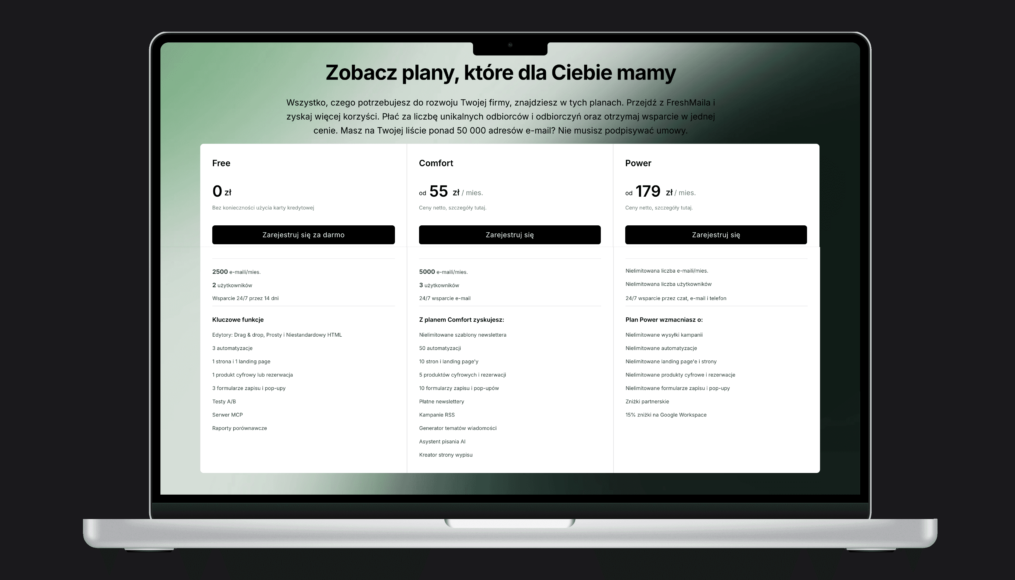
Redesigned pricing as a step-by-step flow. Subscription and support plan presented as one connected journey, not two separate pages.
Problem — pricing
Users didn't know their subscription tier determined their support plan. Daily CS inquiries, high confusion among new signups, no way to track what they were paying for.
Migrate thousands of users - without losing their trust
Migrate thousands of users - without losing their trust
Migrate thousands of users - without losing their trust
Challenge
No existing internal pattern for this migration scope.
Users anxious about data loss, unclear what "moving to MailerLite" meant for their active campaigns.
Challenge
No existing internal pattern for this migration scope.
Users anxious about data loss, unclear what "moving to MailerLite" meant for their active campaigns.
Solution
Step-by-step migration panel designed from scratch.
Each step confirms what transferred, surface what
need attention, and unlocks the next stage. Progress always visible.
Solution
Step-by-step migration panel designed from scratch.Each step confirms what transferred, surface what need attention, and unlocks the next stage. Progress always visible.
Solution
Step-by-step migration panel designed from scratch. Each step confirms what transferred, surface what need attention, and unlocks the next stage. Progress always visible.
The aqusition of MailerLite by Vercom for 345mln PLN was one of the largest Saas transactions in Poland. For exsisting customers it meant moving to an entirely new platform — their contracts, templates, automations, and campaign history.
The most frequent feeback
"The panel is easy and simple to use"
The most frequent feeback
"The panel is easy and simple to use"

WCAG non-compliance
Text contrast on the green CTA button failed AA at 2.1:1. Keyboard focus was invisible. Form fields lacked associated labels, making the flow inaccessible to screen readers entirely.
2


A pricing model that users could not follow
The aqusition of MailerLite by Vercom for 345mln PLN was one of the largest Saas transactions in Poland.
For exsisting customers it meant moving to an entirely new platform
- their contracts, templates, automations, and campaign history.
Solution
A full redesign of all auth screens - focused layout with no visual noise, inline validation replacing post-submit errors, full WCAG AA compliance, and a shared component set that became the foundation of FreshMail's first design system.
Challenge
Three authentication screens built in isolation, with no shared components, no accessibility baseline, and a layout actively distracting users from completing sign-up. Each fix in one place risked breaking another.
Solution
A full redesign of all auth screens - focused layout with no visual noise, inline validation replacing post-submit errors, full WCAG AA compliance, and a shared component set that became the foundation of FreshMail's first design system.
Problem — pricing
Users didn't know their subscription tier determined their support plan. Daily CS inquiries, high confusion among new signups, no way to track what they were paying for.
Problem — navigation
Reaching the invoice panel took 4+ clicks. Users consistently reported not knowing where payments lived in the product.
Solution
Redesigned pricing as a step-by
-step flow. Subscription and support plan presented as one connected journey, not two separate pages.