Role
Brand design
Brand indentity

Logo
The omega symbol carries more meaning than most letters can. In health, it references the essential fatty acids the body depends on — omega-3, omega-6 — nutrients that sustain rather than cure. As the final letter of the Greek alphabet, it speaks to completeness, to coming full circle. For holis, it became the natural anchor of the mark: a symbol that holds wholeness, endurance, and the quiet confidence that real health is built, not prescribed.
Health for Humans,
Not Patients.

Holis is a digital health platform designed around the human being—not the diagnosis.
The brand moves away from the clinical severity of conventional medicine, viewing health as a holistic interplay between body, mind, and environment. Instead of a singular treatment path, holis connects users with a curated network of specialists to build personalized recommendations that fit an individual's life.
Product: holis (Polish startup)
Year: Founded in 2025
Role: Brand design & strategy


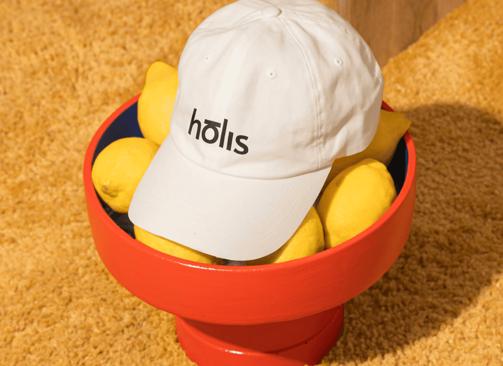
Every screen was designed to feel like a continuation of the brand — not a departure from it. Generous white space, rounded components, and a restrained use of colour ensure that the interface never overwhelms. The goal was clarity that feels effortless: a product that guides without instructing, and supports without prescribing.
Mockups
Colours
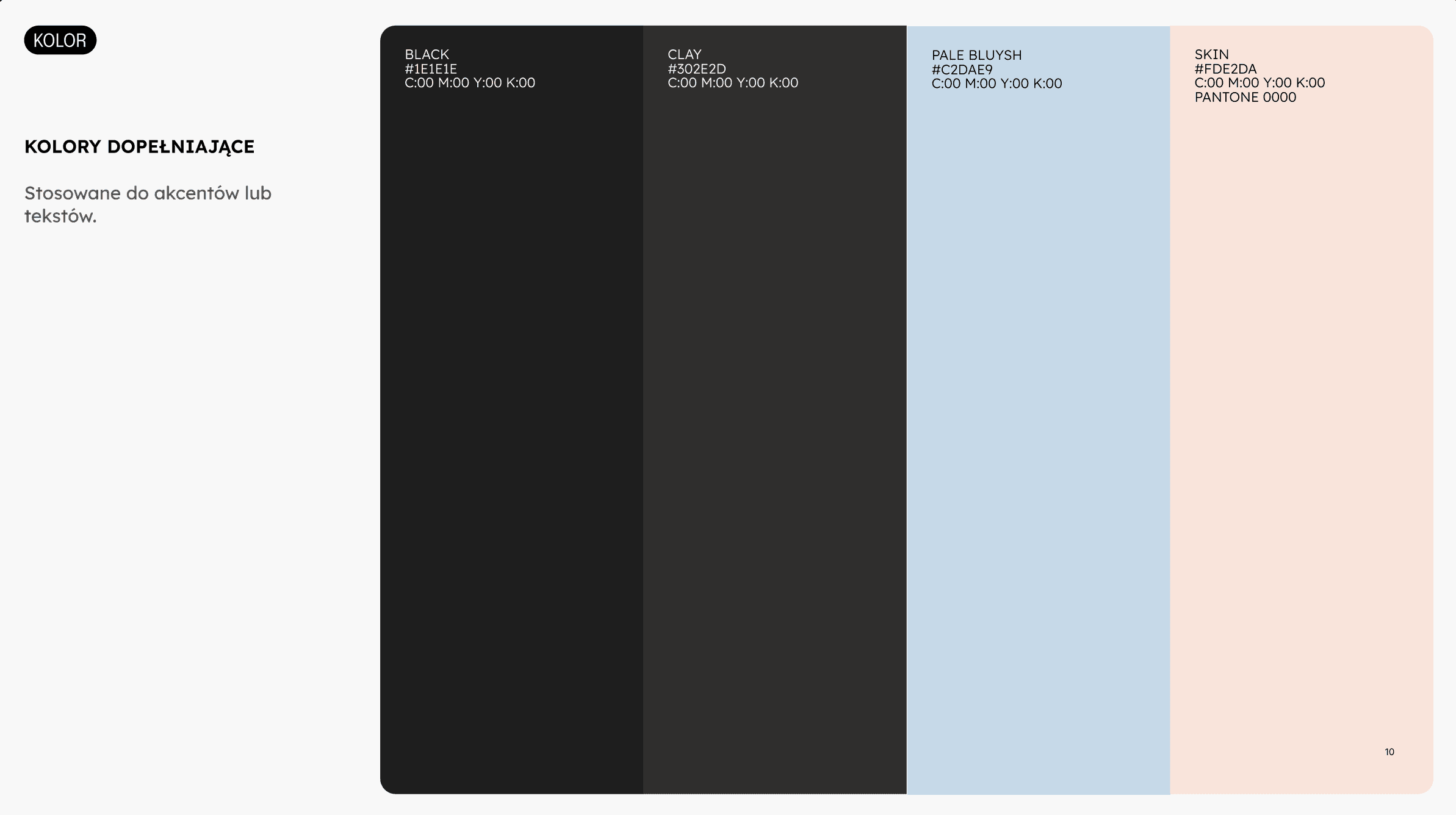
Choosing the palette was about feeling human before feeling medical. We moved away from the saturated greens and clinical whites typical of health brands — choosing instead a palette rooted in nature: muted sage, warm off-white, and soft terracotta as an accent. At the client's request, these colours were extended into gradients — fluid transitions that gave the brand depth and a sense of something alive.
The client brought a clear vision to the table — gradients were a must, a way to add depth and a sense of flow to the brand. We embraced that direction, using them intentionally: subtle transitions that feel organic rather than decorative, reinforcing the idea that health is never a fixed state, but a continuous, living process.
Typography
The typeface needed to feel human and trustworthy without being clinical. We chose a soft geometric sans-serif for headings — approachable yet confident — paired with a neutral secondary font for body text to keep readability at the core.


Logo
Logo
The omega symbol carries more meaning than most letters can. In health, it references the essential fatty acids the body depends on — omega-3, omega-6 — nutrients that sustain rather than cure. As the final letter of the Greek alphabet, it speaks to completeness, to coming full circle. For holis, it became the natural anchor of the mark: a symbol that holds wholeness, endurance, and the quiet confidence that real health is built, not prescribed.
The omega symbol carries more meaning than most letters can. In health, it references the essential fatty acids the body depends on — omega-3, omega-6 — nutrients that sustain rather than cure. As the final letter of the Greek alphabet, it speaks to completeness, to coming full circle. For holis, it became the natural anchor of the mark: a symbol that holds wholeness, endurance, and the quiet confidence that real health is built, not prescribed.
Health for Humans,
Not Patients.
Health for Humans,
Not Patients.
Health for Humans,
Not Patients.
Health for Humans,
Not Patients.
Holis is a digital health platform designed around the human being—not the diagnosis.
The brand moves away from the clinical severity of conventional medicine, viewing health as a holistic interplay between body, mind, and environment. Instead of a singular treatment path, holis connects users with a curated network of specialists to build personalized recommendations that fit an individual's life.
Product: holis (Polish startup)
Year: Founded in 2025
Role: Brand design & strategy
Holis is a digital health platform designed around the human being—not the diagnosis. The brand moves away from the clinical severity of conventional medicine, viewing health as a holistic interplay between body, mind, and environment.
Instead of a singular treatment path, holis connects users with a curated network of specialists to build personalized recommendations that fit an individual's life.
Product: holis (Polish startup)
Year: Founded in 2025
Role: Brand design & strategy
Holis is a digital health platform designed around the human being—not the diagnosis. The brand moves away from the clinical severity of conventional medicine, viewing health as a holistic interplay between body, mind, and environment.
Instead of a singular treatment path, holis connects users with a curated network of specialists to build personalized recommendations that fit an individual's life.
Product: holis (Polish startup)
Year: Founded in 2025
Role: Brand design & strategy
Holis is a digital health platform designed around the human being—not the diagnosis. The brand moves away from the clinical severity of conventional medicine, viewing health as a holistic interplay between body, mind, and environment.
Instead of a singular treatment path, holis connects users with a curated network of specialists to build personalized recommendations that fit an individual's life.
Product: holis (Polish startup)
Year: Founded in 2025
Role: Brand design & strategy
Takeaway
Takeaway
Working with the holis team was a genuinely collaborative process — the client came with a strong sense of direction and the openness to explore. That combination is rare, and it pushed the work further than a brief alone ever could. What started as a brand identity became a shared language: one that speaks to people the way healthcare rarely does — with warmth, clarity, and respect for the whole person behind the symptom.
Working with the holis team was a genuinely collaborative process — the client came with a strong sense of direction and the openness to explore. That combination is rare, and it pushed the work further than a brief alone ever could. What started as a brand identity became
a shared language: one that speaks to people the way healthcare rarely does — with warmth, clarity, and respect for the whole person behind the symptom.
Every screen was designed to feel like a continuation of the brand — not a departure from it. Generous white space, rounded components, and a restrained use of colour ensure that the interface never overwhelms. The goal was clarity that feels effortless: a product that guides without instructing, and supports without prescribing.
Mockups
Colours
Choosing the palette was about feeling human before feeling medical. We moved away from the saturated greens and clinical whites typical of health brands — choosing instead a palette rooted in nature: muted sage, warm off-white, and soft terracotta as an accent. At the client's request, these colours were extended into gradients — fluid transitions that gave the brand depth and a sense of something alive.
Choosing the palette was about feeling human before feeling medical. We moved away from the saturated greens and clinical whites typical of health brands — choosing instead a palette rooted in nature: muted sage, warm off-white, and soft terracotta as an accent. At the client's request, these colours were extended into gradients — fluid transitions that gave the brand depth and a sense of something alive.
The client brought a clear vision to the table — gradients were a must, a way to add depth and a sense of flow to the brand. We embraced that direction, using them intentionally: subtle transitions that feel organic rather than decorative, reinforcing the idea that health is never a fixed state, but a continuous, living process.
The client brought a clear vision to the table — gradients were a must, a way to add depth and a sense of flow to the brand. We embraced that direction, using them intentionally: subtle transitions that feel organic rather than decorative, reinforcing the idea that health is never a fixed state, but a continuous, living process.
Typography
The typeface needed to feel human and trustworthy without being clinical. We chose a soft geometric sans-serif for headings — approachable yet confident — paired with a neutral secondary font for body text to keep readability at the core.
The typeface needed to feel human and trustworthy without being clinical. We chose a soft geometric sans-serif for headings — approachable yet confident — paired with a neutral secondary font for body text to keep readability at the core.


Typography
The typeface needed to feel human and trustworthy without being clinical. We chose
a soft geometric sans-serif for headings — approachable yet confident — paired with a neutral secondary font for body text to keep readability at the core.
Colours
Choosing the palette was about feeling human before feeling medical. We moved away from the saturated greens and clinical whites typical of health brands — choosing instead a palette rooted in nature: muted sage, warm off-white, and soft terracotta as an accent. At the client's request, these colours were extended into gradients — fluid transitions that gave the brand depth and a sense of something alive.
The client brought a clear vision to the table — gradients were a must, a way to add depth and a sense of flow to the brand. We embraced that direction, using them intentionally: subtle transitions that feel organic rather than decorative, reinforcing the idea that health is never a fixed state, but a continuous, living process.
Mockups
Every screen was designed to feel like a continuation of the brand — not a departure from it. Generous white space, rounded components, and a restrained use of colour ensure that the interface never overwhelms. The goal was clarity that feels effortless: a product that guides without instructing, and supports without prescribing.
Takeaway
Working with the holis team was a genuinely collaborative process — the client came with a strong sense of direction and the openness to explore. That combination is rare, and it pushed the work further than a brief alone ever could. What started as a brand identity became
a shared language: one that speaks to people the way healthcare rarely does — with warmth, clarity, and respect for the whole person behind the symptom.