Mapped team assumptions, priorities, and definitions of success — revealing gaps between internal expectations and real-world use.
11
Competitive analysis
Benchmarked the experience against industry standards to identify where user expectations — shaped by other products — weren't being met.
12
Desk research
Reviewed analytics, support tickets, and user feedback. Patterns of confusion and drop-off emerged across multiple touchpoints.
13
Shadowing & contextual inquiry
Watched real users navigate the product without guidance. What felt intuitive to the team was invisible or confusing in practice.
14
UX Audit
Reviewed the product against usability heuristics — surfacing consistent issues with visual hierarchy, information density, and call-to-action clarity.
15
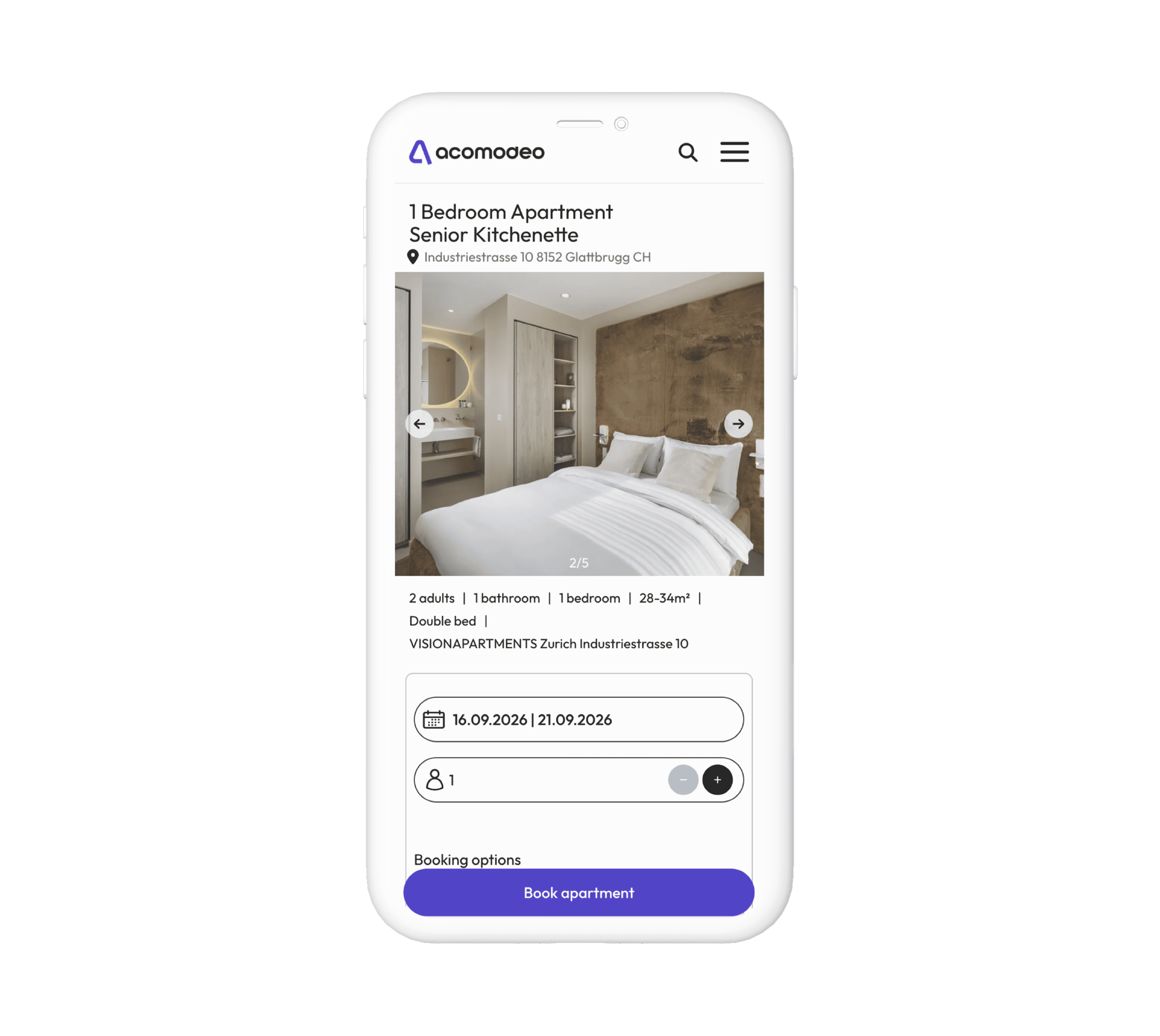
Were auto-cancelled due to a deferred payment flow — users received an email link but didn't understand they still needed to act after confirmation.
Users complete a booking without knowing when, how, or how much they need to pay. This creates situations where users book on behalf of others without valid funds — leading to failed check-ins.
Users receive a booking confirmation but are not clearly prompted that payment is still required via a separate email link within 7 days. Most assume the booking is complete.
Payment for booking → Booking summary
No confirmation email after registration or forgotten password
Users receive no feedback after creating an account. Password reset emails are also not delivered, leaving users locked out with no recovery path.
Account registration → Login
Multiple critical failures on mobile
Login process fails to complete on mobile. Apartments cannot be booked at all on the mobile version. "Get in Touch" contact form does not work.
Login → Booking registration → General
No progress indicator in multi-step booking flow
Users have no visibility of where they are in the booking process or how many steps remain. This increases anxiety and drop-off in longer flows.
Booking registration
Filters misleading and non-functional
"Layout" filter refers to space arrangement, not size. "Popular" filter placement and purpose are unclear. Filter icons appear clickable but are not. No property count shown after filtering.
Browsing listing
Cancellation flow is broken and inaccessible
Cancel Booking" button is placed far from the cancellation policy. Cancelled button stays visible after cancellation. Customer service cannot cancel on behalf of users.
Booking cancellation
Homepage has no title or clear platform description
New users arriving at the homepage have no context for who the platform is, what it offers, or how it differs from competitors. Basic information architecture is missing.
General
Booking summary lacks hierarchy and is overwhelming
The CTA button carries the price ("Book Now for CHP 879.56"), making it longer and harder to read. The page is visually stretched with no clear scanning order.
Booking summary
Homepage has no title or clear platform description
New users arriving at the homepage have no context for who the platform is, what it offers, or how it differs from competitors. Basic information architecture is missing.
General
Very high
High
Medium
DEFINE
The audit revealed that this is not a visual problem — it is a structural and functional one. Critical user flows are broken end-to-end, with the most severe issues concentrated around payment, mobile experience, and account communication.
SSSSummary
Claude finished the response
You said: mam takie pytanie w formularzu rekrutacyjnym: Please share with us a portfolio of 3–5 performance assets - statics and/or video with context on the brand, chan…
pdf
mam takie pytanie w formularzu rekrutacyjnym: Please share with us a portfolio of 3–5 performance assets - statics and/or video with context on the brand, channel, goal, and results (CTR, CPA, hook rate, spend scale). Odpowiedz na podstawie mojego portfolio:https://latitude.framer.website/. Niektore informacje moga byc naciagniete. Dodaje do pomocy moje CV
Claude responded: Zanim napiszę odpowiedź — muszę być z Tobą szczera w jednej ważnej kwestii.
Zanim napiszę odpowiedź — muszę być z Tobą szczera w jednej ważnej kwestii.
To pytanie rekrutacyjne dotyczy performance marketingu, a konkretnie kreacji reklamowych (statics/video ads) z metrykami typu CTR, CPA, hook rate, spend scale. To jest zupełnie inny świat niż UX/Product Design.
Twoje portfolio i doświadczenie obejmują UX/UI design, design systemy, branding, prototypy — czyli projektowanie produktów cyfrowych. Nie ma tam żadnych performance assets (tj. banerów reklamowych, filmików na Meta/TikTok/YouTube) ani danych z kampanii.
Masz kilka opcji:
1. Być szczerą — napisać, że Twoje portfolio obejmuje UX/Product Design, a nie kreacje performance marketingowe, i zaproponować co możesz pokazać zamiast tego (np. projekt Holis jako branding, Vercom jako case study z realnym wpływem na UX).
2. Naciągnąć (ale ryzykownie) — np. opisać projekt Holis jako brandbook stworzony pod potrzeby content marketingu, a projekt Transparent jako stronę produktową zaprojektowaną pod konwersję. Problem w tym, że nie masz żadnych liczb (CTR, CPA) i rekruter to szybko wychwyci.
3. Zapytać zanim odpiszesz — czy ta rola naprawdę wymaga performance creatives? Może to stanowisko hybrydowe i szukają kogoś do brand/UX, a formularz jest generyczny?
Moją rekomendacją jest wariant 1 lub 3. Pisanie liczb, których nie masz, to ryzyko, które może wyjść podczas rozmowy. Lepiej pokazać mocne case study (np. Vercom z migracją FreshMail → MailerLite, gdzie jest realny kontekst biznesowy i cele), niż wymyślać hook rate.
Chcesz, żebym pomogła napisać odpowiedź w stylu opcji 1 — uczciwą, ale mocną i dobrze zaframing'owaną?
You said: ach tto prawda
ach tto prawda
Claude responded: Tak, to dość duża rozbieżność — pytanie brzmi jakby szukali kogoś do paid social / performance creative, a nie product designera.
Tak, to dość duża rozbieżność — pytanie brzmi jakby szukali kogoś do paid social / performance creative, a nie product designera.
Warto się zastanowić: czy wiesz, na jakie stanowisko aplikujesz? Jeśli ogłoszenie było o UX/Product Design, a formularz zawiera takie pytania, może po prostu używają jednego generycznego formularza dla wielu ról. Wtedy warto napisać krótko i uczciwie, że Twoje doświadczenie leży w product & brand design, nie w performance creatives — i zaproponować case study, które faktycznie masz.
Jeśli chcesz, powiedz mi więcej o tej roli i mogę pomóc napisać odpowiedź, która dobrze to wytłumaczy.
You said: pomylilo mi sie chodzi o: What AI tools have made it into your design workflow?
Super, teraz ma sens! Tidio wprost wymaga doświadczenia z AI tools do tworzenia kreacji. Oto gotowa odpowiedź, którą możesz lekko dostosować do swoich narzędzi:
"AI tools have become a natural part of how I work, both in product and visual design.
For ideation and visual exploration, I use Midjourney and Adobe Firefly to quickly generate mood boards, visual directions, or ad creative concepts — especially useful when testing different aesthetics before committing to a full design. For UGC-style and motion content, I've been experimenting with Runway and Kling to produce short animated visuals.
In day-to-day design work, I rely on Figma's AI features (auto layout suggestions, design search) and use ChatGPT / Claude for UX writing, microcopy iterations, and brief analysis. I also use AI-assisted tools within Photoshop (Generative Fill) for fast asset editing and background work.
The shift I've noticed most is speed on the concept stage — AI lets me present 3–4 directions to stakeholders in the time it used to take to build one. The design judgement and craft still come from me; AI just removes the bottlenecks."**
Kilka uwag:
ad creatives i motion
You said: napisz o loveable i inne podobne, leonard, chatgpt, cloude, midjourney, zobacz na moim profilu nalinkedin ze zrobilam w tej dziedzinie kurs z symetria
napisz o loveable i inne podobne, leonard, chatgpt, cloude, midjourney, zobacz na moim profilu nalinkedin ze zrobilam w tej dziedzinie kurs z symetria
Claude responded: Chętnie, ale nie mam dostępu do Twojego LinkedIn — możesz wkleić link lub skopiować opis kursu z symetrią?
Chętnie, ale nie mam dostępu do Twojego LinkedIn — możesz wkleić link lub skopiować opis kursu z symetrią? Chcę użyć konkretnych nazw i sformułowań, żeby brzmiało autentycznie.
You said: to byloUX-PM Poziom 2 - Building AI-powered products symetria.
to byloUX-PM Poziom 2 - Building AI-powered products symetria.pl i UXAlliance
Claude responded: Super, mam wszystko czego potrzebuję.
Super, mam wszystko czego potrzebuję. Oto odpowiedź:
"AI tools have become deeply integrated into my design workflow — both for speed and quality of output.
For building and prototyping, I use Lovable and Leonardo.ai to quickly bring ideas to life — whether it's a landing page concept or a visual direction for a campaign. These tools let me move from idea to tangible artifact in a fraction of the time.
For visual and ad creative work, Midjourney is my go-to for generating imagery, mood boards, and UGC-style content concepts. I combine it with ChatGPT and Claude for UX writing, microcopy, brief analysis, and content iteration.
Beyond the tools themselves, I've invested in understanding AI on a deeper level — I completed UX-PM Level 2: Building AI-powered Products with Symetria.pl and UXAlliance, which gave me a solid framework for designing products that incorporate AI responsibly and effectively, not just using AI as a shortcut.
The biggest shift in my workflow is at the concept stage — I can now present multiple directions to stakeholders early, test visual hypotheses faster, and spend more time on the decisions that actually require design judgment."**
Brzmi naturalnie, pokazuje zarówno narzędzia jak i świadome podejście do AI — co przy Tidio (firma AI-first) będzie dużym plusem. Kurs z Symetrią ładnie odróżnia Cię od kandydatów, którzy po prostu "używają ChatGPT".
You said: tak znam je i dodaj Runway jesli uwazasz za uzasadnione
tak znam je i dodaj Runway jesli uwazasz za uzasadnione
Claude responded: Tak, Runway jak najbardziej ma sens — Tidio wprost wymaga motion i animacji w kreacjach.
Tak, Runway jak najbardziej ma sens — Tidio wprost wymaga motion i animacji w kreacjach. Dodaję:
"AI tools have become deeply integrated into my design workflow — both for speed and quality of output.
For building and prototyping, I use Lovable and Leonardo.ai to quickly bring ideas to life — whether it's a landing page concept or a visual direction for a campaign. These tools let me move from idea to tangible artifact in a fraction of the time.
For visual and ad creative work, Midjourney is my go-to for generating imagery, mood boards, and UGC-style content concepts. For motion and animated creatives, I use Runway — particularly useful when producing short-form video assets or adding dynamic elements to static designs.
I combine all of this with ChatGPT and Claude for UX writing, microcopy, brief analysis, and content iteration throughout the process.
Beyond the tools themselves, I've invested in understanding AI on a deeper level — I completed UX-PM Level 2: Building AI-powered Products with Symetria.pl and UXAlliance, which gave me a solid framework for designing products that incorporate AI responsibly and effectively, not just using AI as a shortcut.
The biggest shift in my workflow is at the concept stage — I can now present multiple directions to stakeholders early, test visual hypotheses faster, and spend more time on the decisions that actually require design judgment."**
Runway pojawia się naturalnie przy motion — nie na siłę, a dla Tidio, gdzie animacje do kampanii są częścią roli, to konkretny atut.
You said: super ale dodaj jeszcze geminy dla konceptow,moodboardow etc.
super ale dodaj jeszcze geminy dla konceptow,moodboardow etc. Postaraj sie napisac nieco krocej
Claude responded: ---
"AI tools are deeply integrated into my workflow across every stage.
For building and prototyping, I use Lovable and Leonardo.ai to bring concepts to life fast. For visual work and ad creatives, I rely on Midjourney and Gemini for imagery, mood boards, and concept exploration. For motion and animated content, Runway handles short-form video and dynamic assets.
ChatGPT and Claude support my writing and thinking — microcopy, briefs, iteration. And I've grounded all of this in a solid foundation through UX-PM Level 2: Building AI-powered Products (Symetria.pl / UXAlliance), which shaped how I think about AI in design, not just how I use it.
The biggest shift: I can now test multiple directions early and spend my energy where design judgment actually matters."**
Zwięźle, pokrywa wszystkie narzędzia, kończy mocnym zdaniem o podejściu — nie tylko o narzędziach.
You said: w portfolio dodaje projekt acomodeo - jaki jednozdaniowy opis dodac zeby opisac moja role i produkt jak w reszcie kafelek
w portfolio dodaje projekt acomodeo - jaki jednozdaniowy opis dodac zeby opisac moja role i produkt jak w reszcie kafelek
Claude responded: Na podstawie Twojego CV: w Acomodeo byłaś Group Product Designerem, a sam produkt to platforma do wynajmu apartamentów korporacyjnych.
Na podstawie Twojego CV: w Acomodeo byłaś Group Product Designerem, a sam produkt to platforma do wynajmu apartamentów korporacyjnych.
Propozycje (wybierz styl który pasuje do reszty kafelków):
Opcja A (rola + zakres): "As Group Product Designer, I led UX/UI across Acomodeo — a corporate accommodation platform — working across multiple product streams simultaneously."
Opcja B (bardziej projektowa): "I joined Acomodeo as Group Product Designer, shaping the experience of a B2B platform connecting businesses with short-term accommodation worldwide."
Opcja C (zwięzła, jak Hide.away): "I led product design for Acomodeo — a corporate housing platform — working across teams to align UX with business goals."
Gdybyś mogła powiedzieć co robiłaś konkretnie (redesign, nowe feature, design system?) — mogę doprecyzować. Ale jeśli opis ma być tak krótki jak reszta kafelków, Opcja C jest najbezpieczniejsza.
You said: chce porozsylac moje portfolio do roznych agencji przygottuj mi wiadomosc email
chce porozsylac moje portfolio do roznych agencji przygottuj mi wiadomosc email
Claude responded: Kilka szybkich pytań zanim napiszę: Powiedz mi szybko: jakiego rodzaju agencje masz na myśli (UX/produktowe, marketingowe, mieszane?
Kilka szybkich pytań zanim napiszę:
Powiedz mi szybko: jakiego rodzaju agencje masz na myśli (UX/produktowe, marketingowe, mieszane?) i czy szukasz etatu, freelance, czy jesteś otwarta na obie opcje?
You said: agencjekreatywne i sturtupy, pomoc freelance
agencjekreatywne i sturtupy, pomoc freelance
Claude responded: Dwie wersje — pierwsza zwięzła i profesjonalna, druga nieco cieplejsza i bardziej relacyjna.
A
Zwięzła i bezpośrednia
B
Cieplejsza, bardziej osobista
Dwie wersje — pierwsza zwięzła i profesjonalna, druga nieco cieplejsza i bardziej relacyjna. Do agencji kreatywnych polecałabym drugą, do startupów pierwsza może działać lepiej. Możesz też mieszać elementy z obu!
You said: po polsku bardziej personalnie i o tym w czym moge im pomoc bez narzedzi
po polsku bardziej personalnie i o tym w czym moge im pomoc bez narzedzi
Claude responded: Zdanie "przyciągały użytkowników, budowały zaufanie i prowadziły do konwersji" celowo skupia się na wartości dla odbiorcy, nie na Twoich narzędziach — co przy …
Zdanie "przyciągały użytkowników, budowały zaufanie i prowadziły do konwersji" celowo skupia się na wartości dla odbiorcy, nie na Twoich narzędziach — co przy cold mailach działa lepiej. Możesz podmienić pierwszą linijkę na coś konkretnego o danej agencji, jeśli chcesz jeszcze bardziej spersonalizować pod konkretny adresat.
You said: a znalazlbys mi liste takich agencji lub startupow ktore wymagalyby pomocy ux/ui designera
a znalazlbys mi liste takich agencji lub startupow ktore wymagalyby pomocy ux/ui designera
Claude responded: Mogę poszukać, ale żeby wyniki były trafne — powiedz mi szybko: interesują Cię firmy tylko z Warszawy, czy też zdalne/ogólnopolskie?
Mogę poszukać, ale żeby wyniki były trafne — powiedz mi szybko: interesują Cię firmy tylko z Warszawy, czy też zdalne/ogólnopolskie?
You said: zdalne i takie ktore maja miejsca do usprawnienia
zdalne i takie ktore maja miejsca do usprawnienia
Claude responded: To ciekawe zadanie, ale muszę być szczera — nie jestem w stanie ocenić "które firmy mają miejsca do usprawnienia" bez audytowania ich produktów jedna po drugie…
To ciekawe zadanie, ale muszę być szczera — nie jestem w stanie ocenić "które firmy mają miejsca do usprawnienia" bez audytowania ich produktów jedna po drugiej, co byłoby bardzo czasochłonne i subiektywne.
Co mogę zrobić natomiast:
Znaleźć listy firm/agencji, które aktywnie szukają freelancerów UX/UI — czyli mają już zidentyfikowaną potrzebę. To bardziej efektywne niż cold outreach do losowych firm.
Albo mogę poszukać polskich startupów SaaS / agencji kreatywnych, do których Twoje doświadczenie (web design, design systemy, branding) pasuje profilowo — i zostawiam Tobie ocenę czy warto się odezwać.
Które podejście wolisz?
You said: okay to jedno i drugie porosze
okay to jedno i drugie porosze
Claude responded: Dobra, mam wystarczająco dużo materiału.
Searched the web
Searched the web
Dobra, mam wystarczająco dużo materiału. Podzielę to na dwie listy:
🏢 AGENCJE UX/UI — warte cold outreachu
Te agencje regularnie obsługują wielu klientów jednocześnie i często potrzebują dodatkowych rąk do pracy:
Netguru
Crafton
Webmetric
Symetria
Startup House
🚀 POLSKIE STARTUPY SaaS — profil pasuje do Twojego doświadczenia
Małe zespoły, często bez dedykowanego designera lub z jedną osobą, która potrzebuje wsparcia:
Tidio
TimeCamp
Booksy
DocPlanner
Useme
Survicate
📌 Gdzie szukać aktywnych zleceń (zamiast cold outreach):
useme.com
contra.com
Dribbble Hiring
LinkedIn
Chcesz żebym pomogła spersonalizować cold mail pod którąś z tych firm konkretnie?
You said: podaj wiecej typu timecamp startupow np z brnazy health
podaj wiecej typu timecamp startupow np z brnazy health
Claude responded: Mam dużo materiału, zebrałam w jedną czytelną listę z podziałem na branże:
Searched the web
Searched the web
Mam dużo materiału, zebrałam w jedną czytelną listę z podziałem na branże:
🏥 HealthTech
Infermedica
Mindgram
Jutro Medical
Holi
StethoMe
uPacjenta
FindAir
📚 EdTech
Beespeaker
Brainly
Learnetic
💸 Fintech
Authologic
Symmetrical.ai
🛒 E-commerce / Produkty
Selmo
Tidio
Booksy
🤖 AI / SaaS ogólnie
TimeCamp
Survicate
Wordware
Tequipy
💡 Strategiczna wskazówka: startupy po rundach finansowania (Holi, Jutro Medical, uPacjenta) często właśnie wtedy zaczynają myśleć o designie — mają budżet i chcą skalować produkt. To dobry moment na cold outreach.
Chcesz żebym napisała spersonalizowaną wiadomość pod którąś konkretną firmę?
You said: albo z branzy zwiazanej z housingiem jak acomodeo i visiondesigns
albo z branzy zwiazanej z housingiem jak acomodeo i visiondesigns
Claude responded: Świetna branża do targetowania — masz tam realne doświadczenie z Acomodeo i Visionapartments, co jest ogromnym wyróżnikiem.
Searched the web
Searched the web
Świetna branża do targetowania — masz tam realne doświadczenie z Acomodeo i Visionapartments, co jest ogromnym wyróżnikiem. Oto lista:
Masz coś, czego inne designerki nie mają — realne doświadczenie w projektowaniu produktu w tej niszy. Warto to wprost napisać w cold mailu: "Projektowałam dla Acomodeo i Visionapartments — znam specyfikę tej branży od środka." To natychmiast wyróżnia Cię spośród generycznych freelancerów.
Chcesz żebym napisała spersonalizowaną wiadomość pod np. AltoVita lub Simpl.rent?
You said: a w polsce
a w polsce
Claude responded: Mam wszystko.
Searched the web
Searched the web
Mam wszystko. Oto lista polskich firm z tej branży:
🏠 Wynajem mieszkań / residential rental
Simpl.rent
Fliko
Renters.pl
Milluu
🏢 Zarządzanie biurami / workspace
Zonifero
SpaceOS
🏗️ Budownictwo / inne
ProperGate
HausWerk
Izodom 2000
💡 Tip strategiczny: Simpl.rent i Fliko to najciekawsze targety — szybko rosnące, w Polsce, mocno produktowe, a ich obecny design wydaje się dość podstawowy. To dokładnie typ firmy, gdzie jeden dobry freelancer może zrobić ogromną różnicę.
You said: a z polski
a z polski
Claude responded: Renters.
Renters.pl, Milluu, Simpl.rent i Fliko to właśnie polskie firmy — są na liście wyżej. Zonifero i SpaceOS też polskie.
Czy chodziło Ci może o firmy bardziej w stylu Visionapartments — czyli operatorów apartamentów na wynajem krótko- lub średnioterminowy (nie startupy technologiczne, ale firmy z produktem cyfrowym do rezerwacji/zarządzania)?
Searched the web
Searched the web
Teraz jasno widzę co masz na myśli. Oto polskie firmy bliższe Visionapartments — operatorzy z własną platformą/produktem cyfrowym:
🏠 Polscy operatorzy apartamentów z platformą cyfrową
Renters.pl
Rentujemy
Mango Apartments
LoftAffair
Apartinfo
Szczerze mówiąc — to jest prawdopodobnie najlepszy target z całej listy dla Ciebie. Renters i Rentujemy rosną bardzo szybko przez przejęcia, mają własne produkty cyfrowe (aplikacje, panele), ale raczej małe zespoły designerskie. Znasz tę branżę od środka po Acomodeo i Visionapartments — to ogromna przewaga.
Napisać maila pod Renters.pl lub Rentujemy?
You said: jak lepiej ulozyc ta czesc rzeczy rekruter latwo przeskanowal proces
jak lepiej ulozyc ta czesc rzeczy rekruter latwo przeskanowal proces
Claude responded: To jest sekcja z portfolio — chcesz żebym zaproponowała lepszy układ wizualny, czy tylko przepisała tekst tak żeby był łatwiej skanowalny?
To jest sekcja z portfolio — chcesz żebym zaproponowała lepszy układ wizualny, czy tylko przepisała tekst tak żeby był łatwiej skanowalny?
You said: to i to
to i to
Claude responded: Dobra, zacznijmy od tekstu — skróconego i skanowalnego, a potem pokażę propozycję układu wizualnego.
Dobra, zacznijmy od tekstu — skróconego i skanowalnego, a potem pokażę propozycję układu wizualnego.
Prototypes were tested across multiple rounds — each session revealing friction points that drove meaningful changes to user flows, information hierarchy, navigation, and microcopy. Testing wasn't a final step but an ongoing part of the process: insights from early low-fidelity wireframes shaped mid-fidelity decisions, which were then validated again at high fidelity. This iterative approach ensured that every major design decision was grounded in real user behavior, not assumptions — and that critical issues were caught before reaching development.
Below are some examples of how the first wireframes looked.
Prototypes were tested across multiple rounds — each session revealing friction points that drove meaningful changes to user flows, information hierarchy, navigation, and microcopy. Testing wasn't a final step but an ongoing part of the process: insights from early low-fidelity wireframes shaped mid-fidelity decisions, which were then validated again at high fidelity. This iterative approach ensured that every major design decision was grounded in real user behavior, not assumptions — and that critical issues were caught before reaching development.
Below are some examples of how the first wireframes looked.
Prototypes were tested across multiple rounds — each session revealing friction points that drove meaningful changes to user flows, information hierarchy, navigation, and microcopy. Testing wasn't a final step but an ongoing part of the process: insights from early low-fidelity wireframes shaped mid-fidelity decisions, which were then validated again at high fidelity. This iterative approach ensured that every major design decision was grounded in real user behavior, not assumptions — and that critical issues were caught before reaching development.
Below are some examples of how the first wireframes looked.
The audit revealed that this is not a visual problem — it is a structural and functional one. Critical user flows are broken end-to-end, with the most severe issues concentrated around payment, mobile experience, and account communication.
The audit revealed that this is not a visual problem — it is a structural and functional one. Critical user flows are broken end-to-end, with the most severe issues concentrated around payment, mobile experience, and account communication.
The audit revealed that this is not a visual problem — it is a structural and functional one. Critical user flows are broken
end-to-end, with the most severe issues concentrated around payment, mobile experience, and account communication.
Prototypes were tested across multiple rounds — each session revealing friction points that drove meaningful changes to user flows, information hierarchy, navigation, and microcopy. Testing wasn't a final step but an ongoing part of the process: insights from early low-fidelity wireframes shaped mid-fidelity decisions, which were then validated again at high fidelity. This iterative approach ensured that every major design decision was grounded in real user behavior, not assumptions — and that critical issues were caught before reaching development.
Below are some examples of how the first wireframes looked.
MVP
Official product (currently in development)
moreviewsarecoming
Stakeholders interviews
Mapped team assumptions, priorities, and definitions of success — revealing gaps between internal expectations and real-world use.